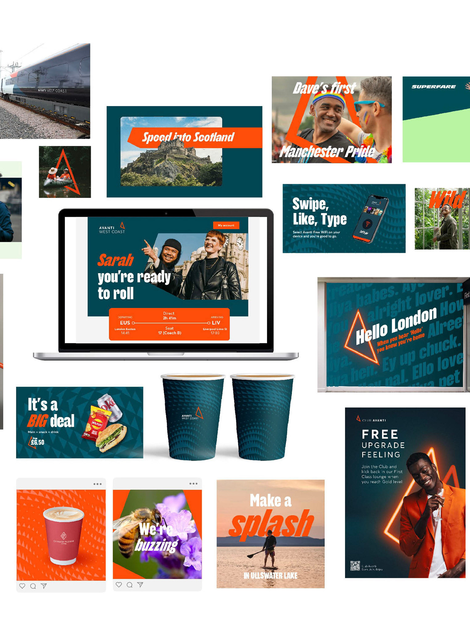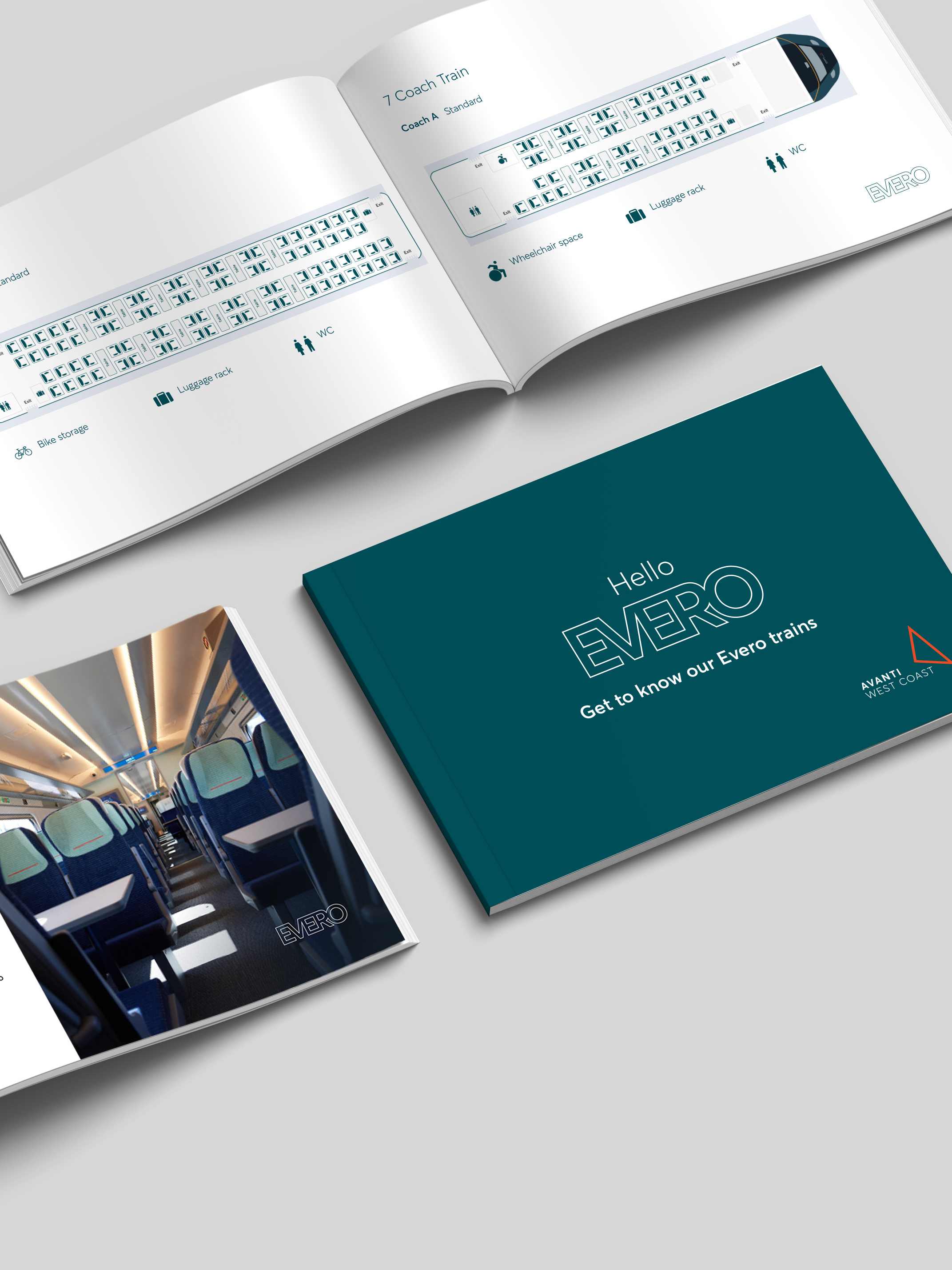
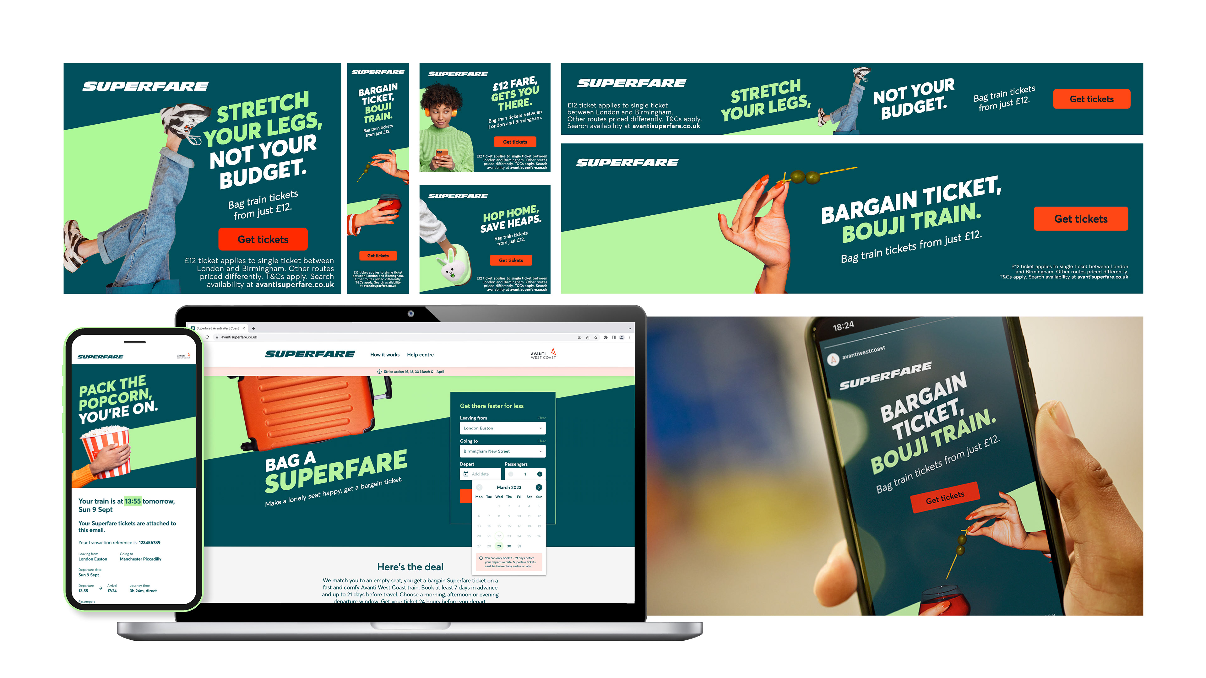
With the Senior designer taking lead, Superfare was an exciting opportunity to create a fresh, engaging identity for our newest and most flexible ticketing options. Our goal was to strike the perfect balance between affordability, simplicity, and trust—ensuring that Superfare felt both intuitive and unmistakably Avanti.
Key Design & Branding Considerations:
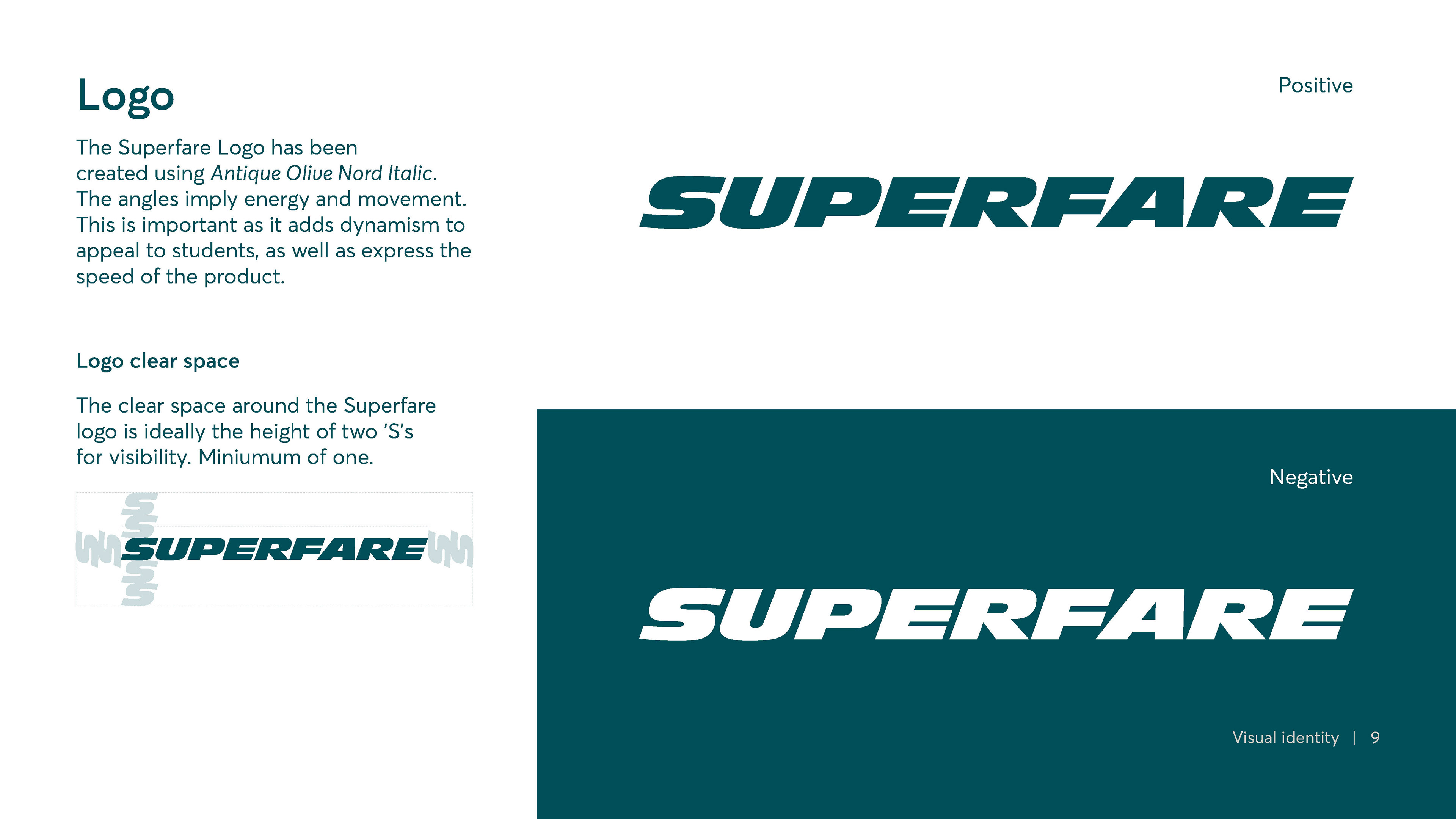
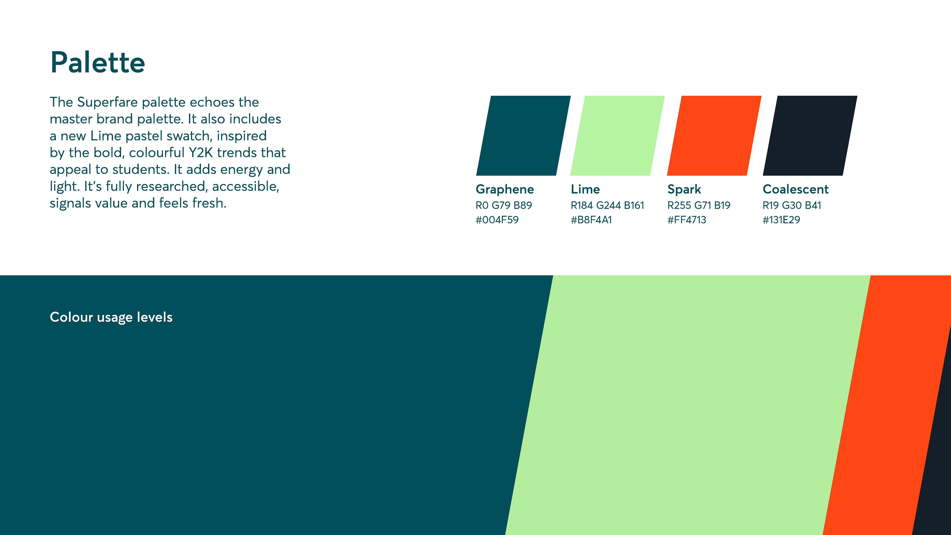
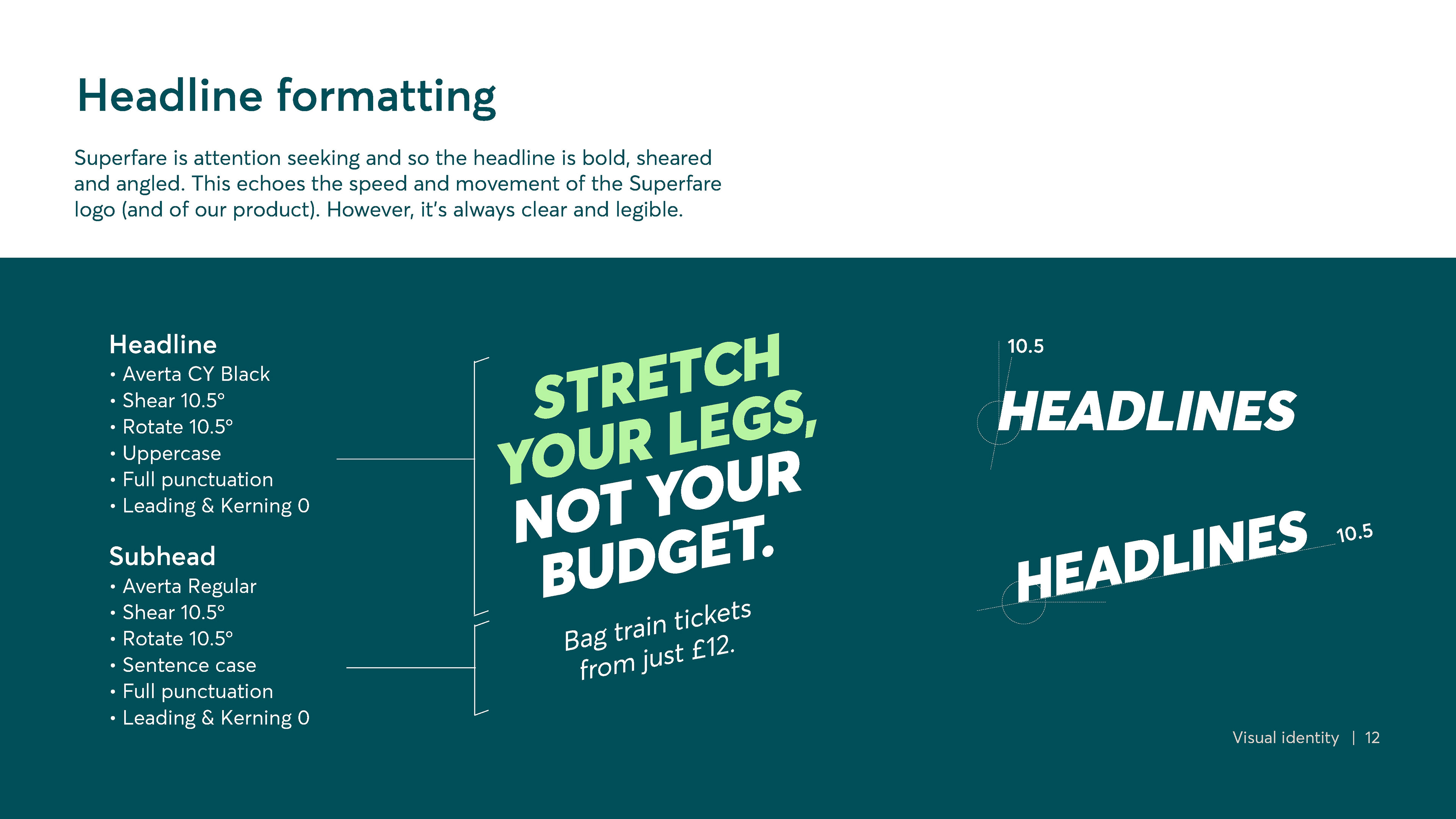
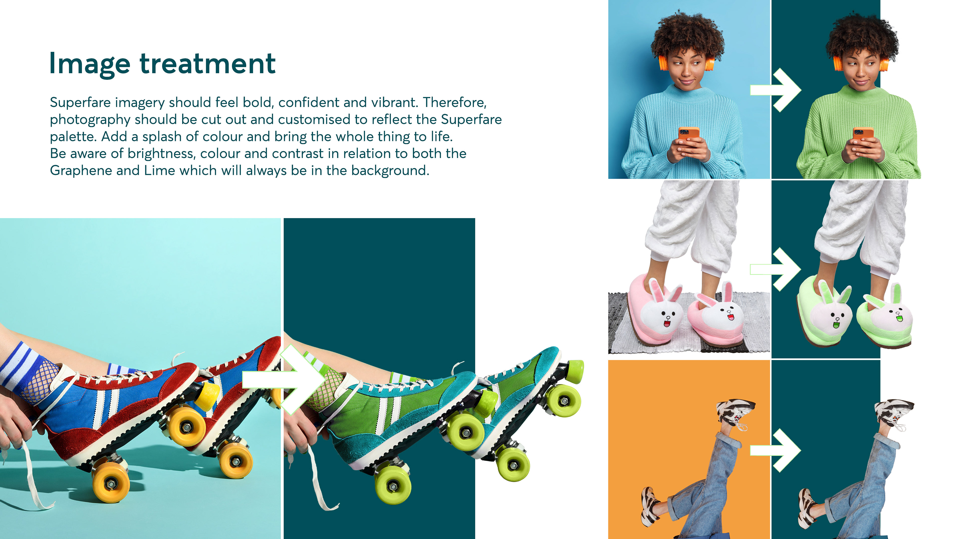
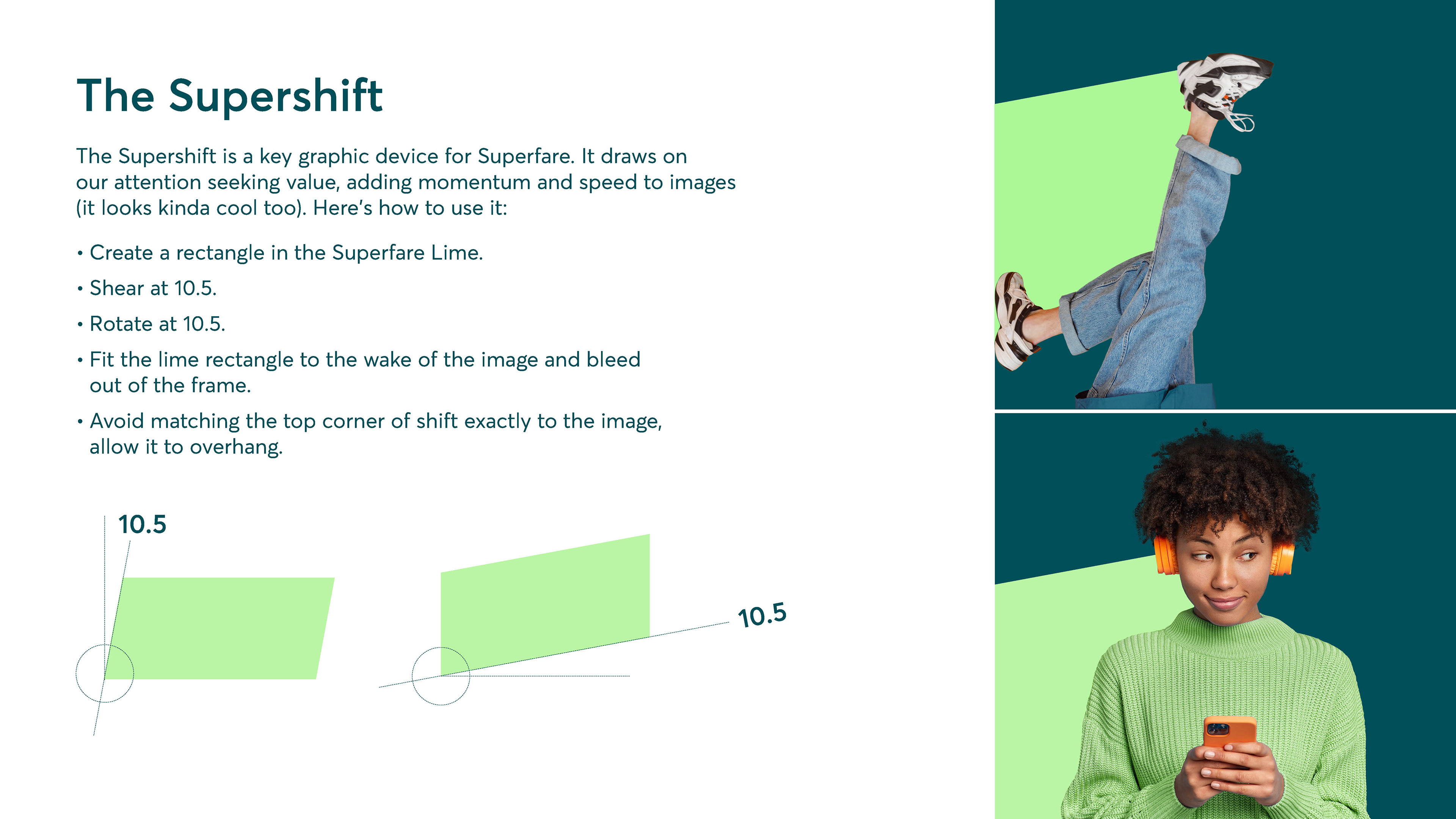
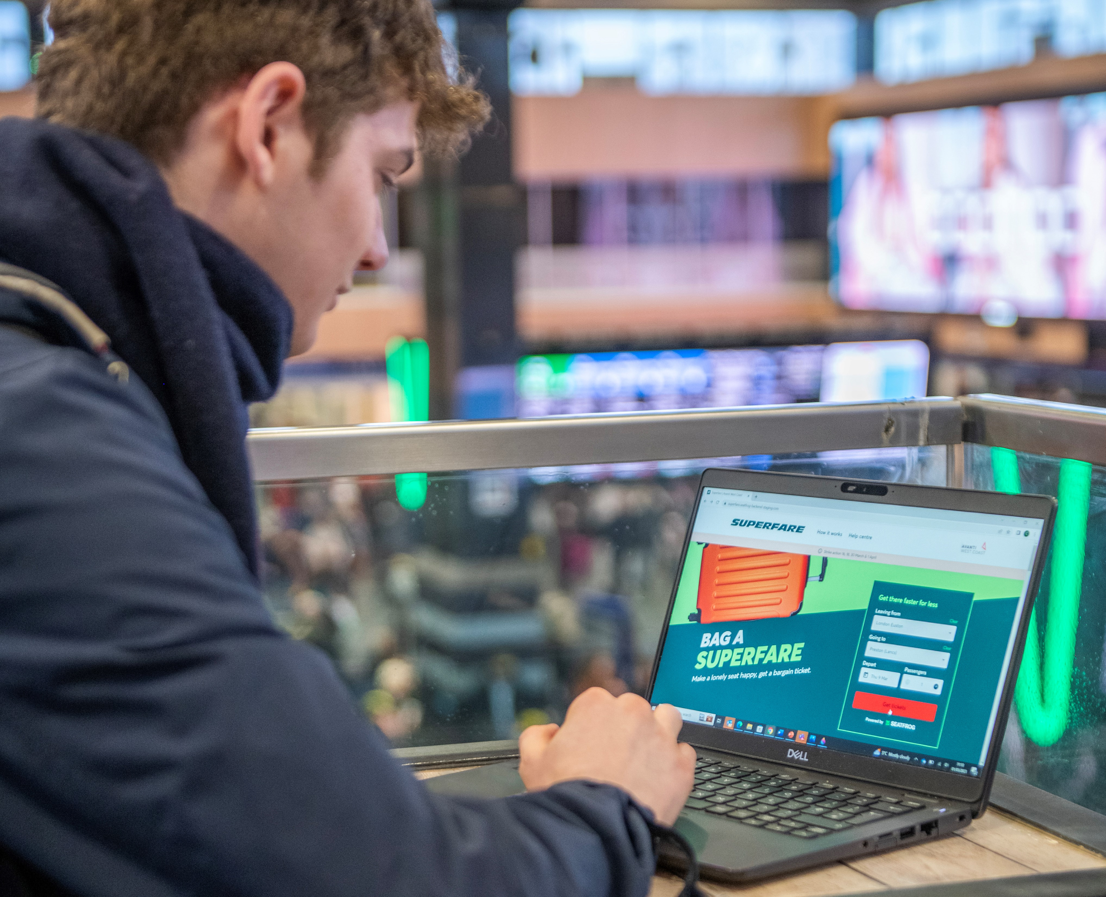
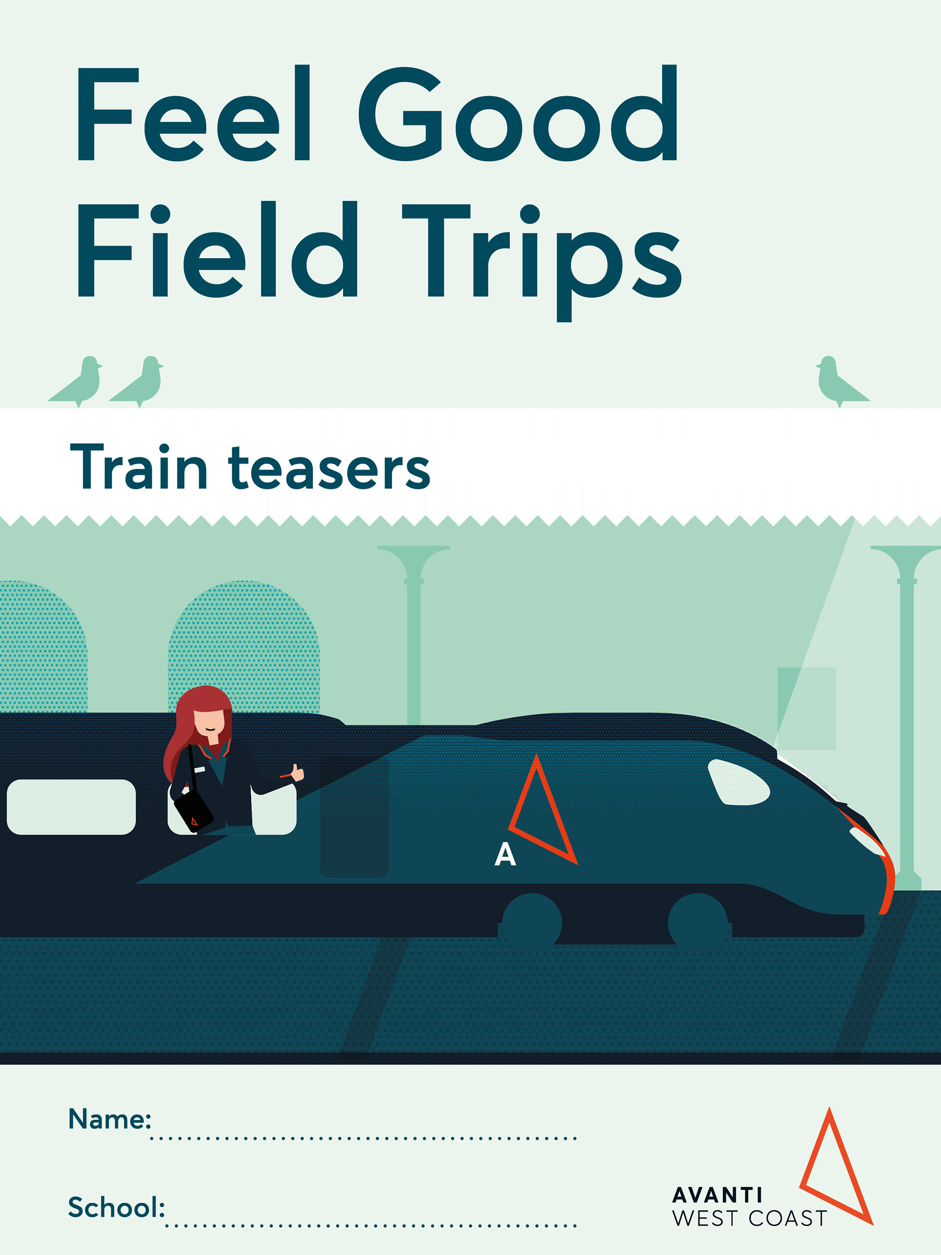
We kept the visuals bold and engaging, leveraging Avanti’s signature colour palette with an added lime green as well as clean typography to ensure clarity.
Working with our in-house copywriter, messaging needed to be simple and inviting, reinforcing the ease of booking while emphasising the cost-saving benefits.
Working closely with ODA and our copywriter to develop a tone that felt playful yet professional, encouraging customers to embrace the flexibility of Superfare without any confusion.
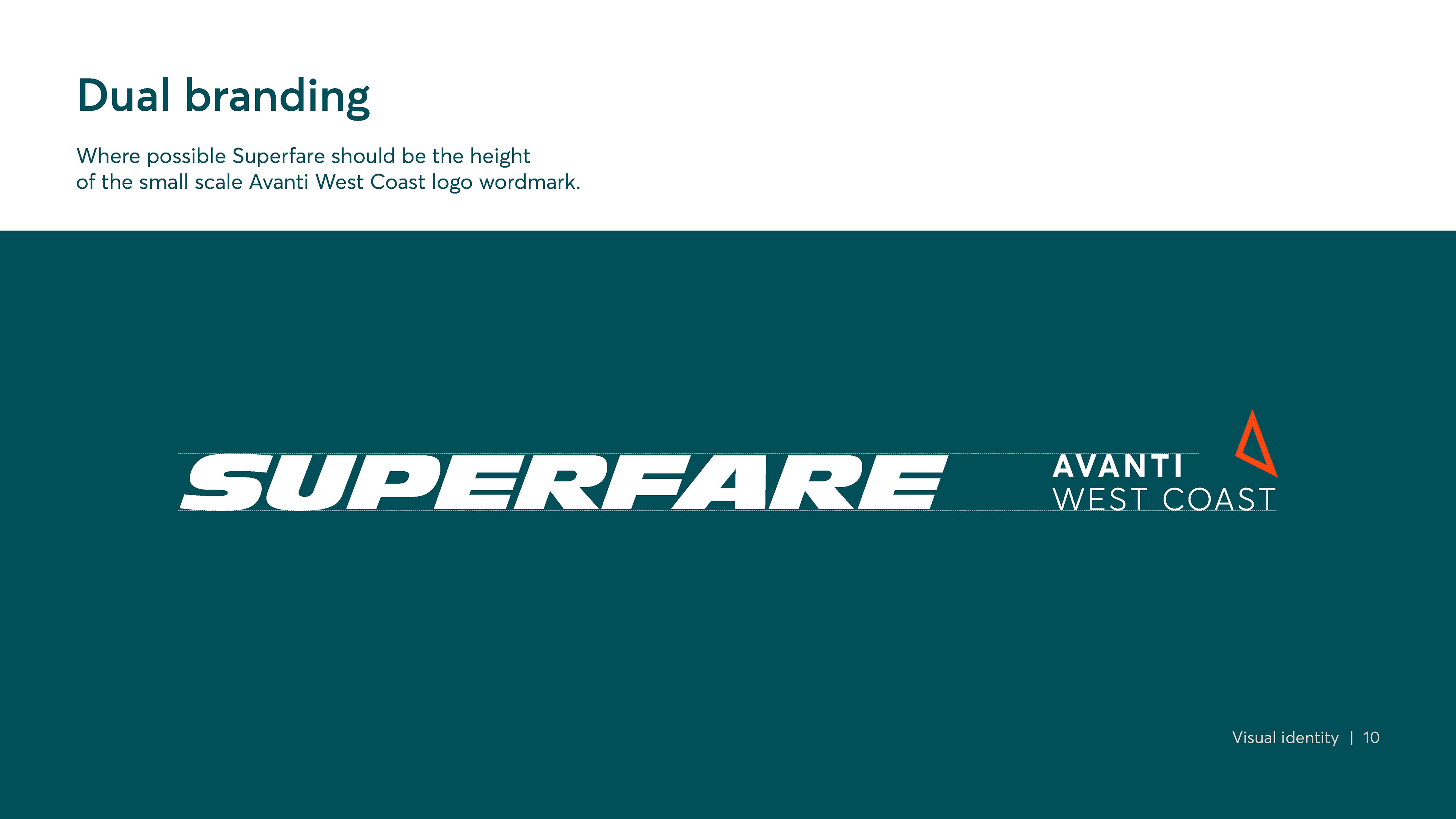
It was essential that Superfare seamlessly integrated into Avanti’s wider brand identity, whether on digital platforms, advertising, or customer communications.
Tools used:
Photoshop, Illustrator, Indesign
Photoshop, Illustrator, Indesign